YML

Kaiser Permanente Digital Healthcare

At YML, we were tasked by Kaiser Permanente across design, engineering and product strategy to build, launch, and optimize their digital ecosystem. In less than a year, Kaiser Permanente’s web and mobile redesigns improved member’s overall satisfaction with digital from 86% to 92%, the first increase after a five-year flat trend. We were able to deliver on our goals, and we beat out Nike, Apple, and Warby Parker to pick up a Webby Award for best health app in the process.

Kaiser Permanente Webby Award
The Challenge

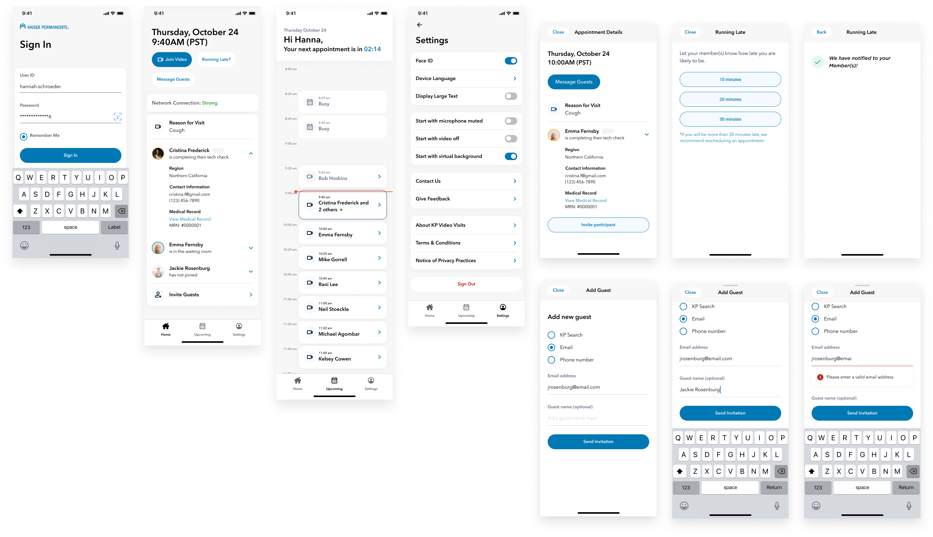
Building a digital healthcare ecosystem during a global pandemic

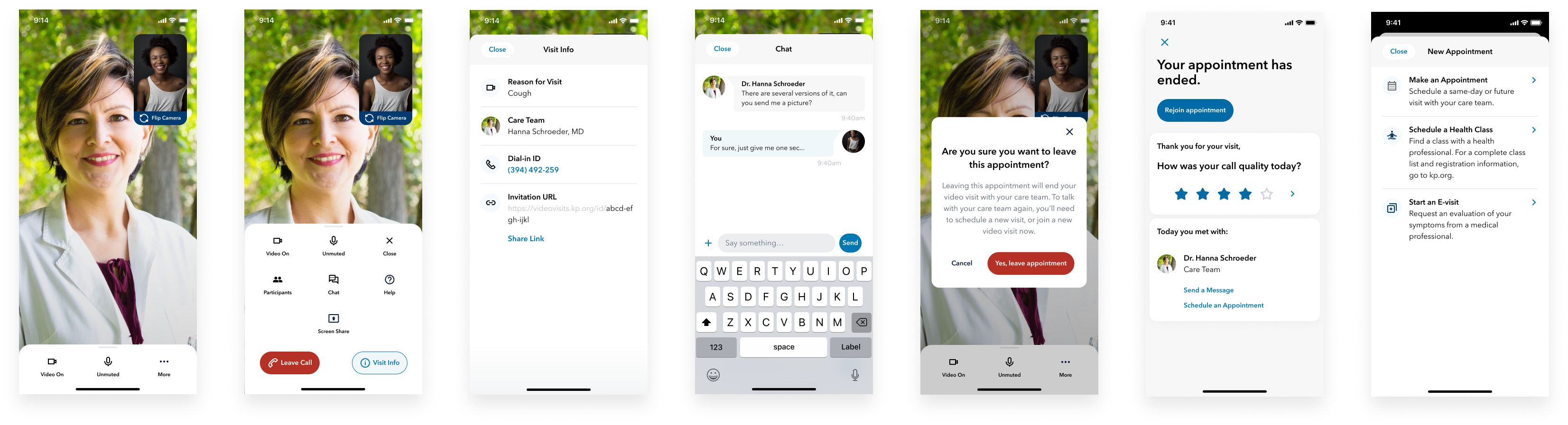
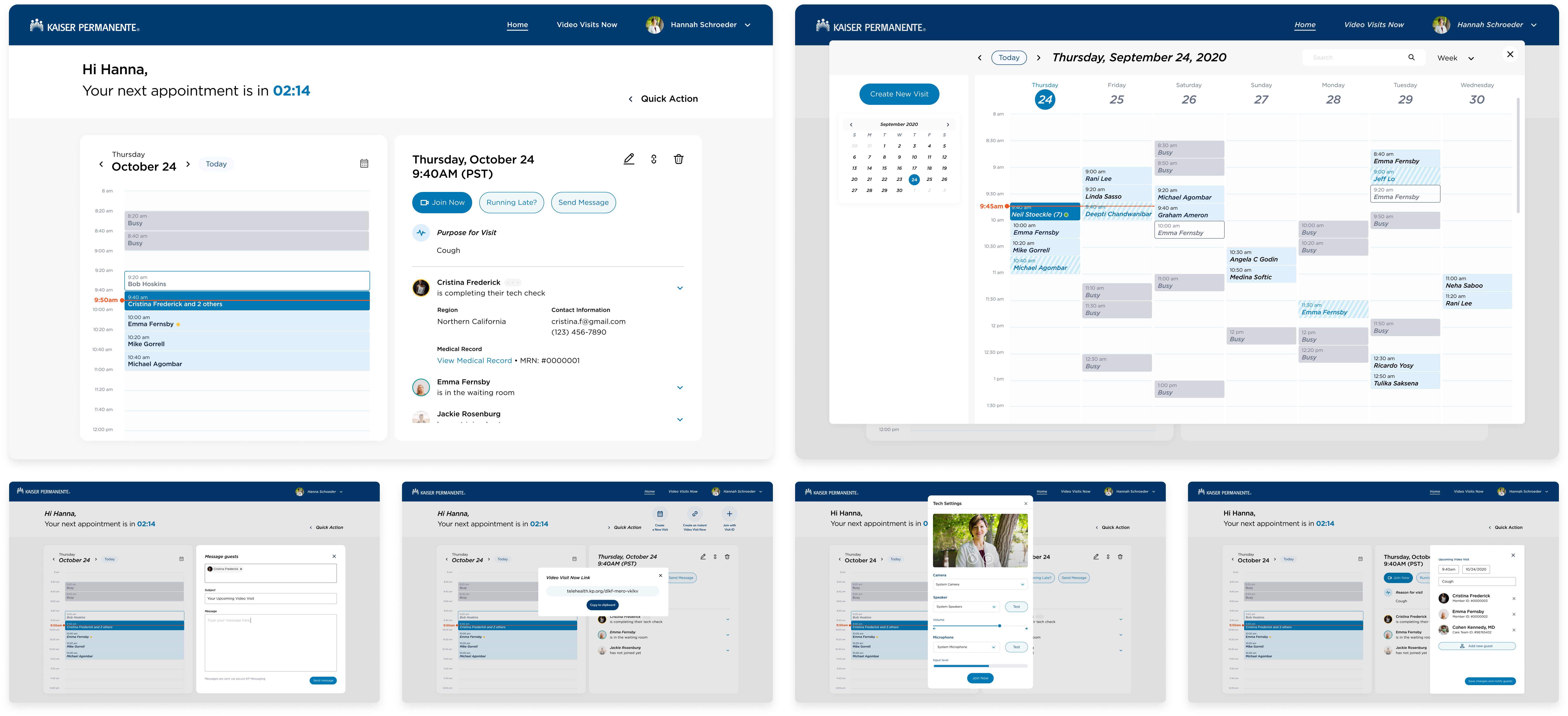
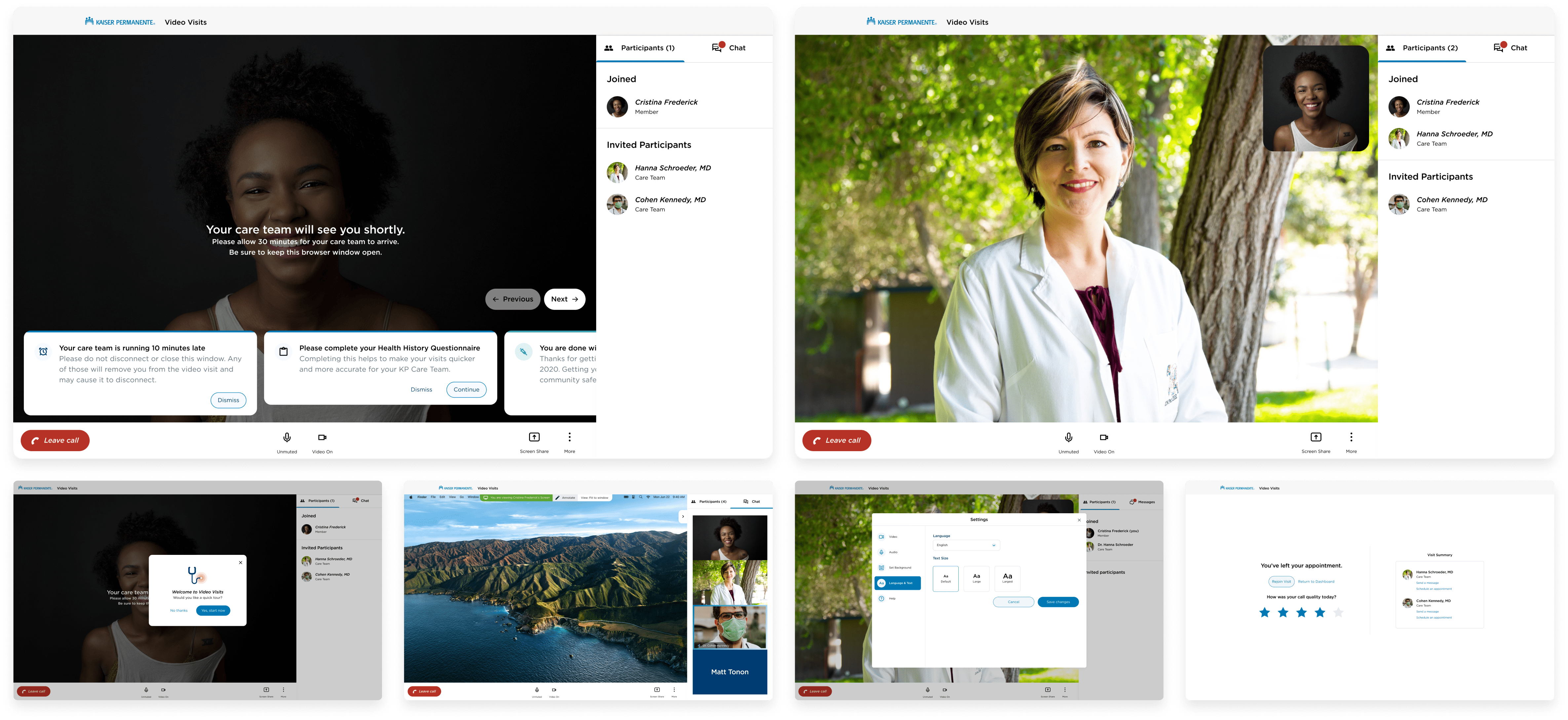
In late 2020, two of the biggest topics in the world were healthcare and video calls. Kaiser Permanente hired YML to create a new digital healthcare ecosystem, including on-demand support via video, telephone, or chat. We needed to quickly understand how to deliver simple UX for patients, while navigating the complex needs and constraints of the healthcare industry.

Role

Senior Product Designer

Lead designer for the video visits portion of Kaiser Permanente's digital healthcare ecosystem

Team

Cross-functional

Creative Director, Junior Product Designer, Front-End Developers, Product Manager

Kaiser Permanente Mobile Scheduling
The Results

Dramatic improvements across key metrics

The result was a self-service tool called Get Care Now, a virtual care solution that leverages smart symptom assessment to increase speed, success, and ease of use for people to get care in the midst of a global pandemic. In less than a year, Kaiser Permanente's web and mobile redesigns improved member's overall satisfaction with digital from 86% to 92%, the first increase after a five-year flat trend.

Impact
+60%

Year-over-year increase in appointments booked

+80%

Increased lab tests viewed online

+22%

Year-over-year increase in medical bills paid online

Mobile Design

Designing for all patients

We couldn't assume that every patient is a young, tech-friendly, and healthy individual. We kept accessibility considerations at the forefront of our thinking, and sought to never make the patient have to make any assumptions.

Accessibility First

Large, bold, and clear CTAs with simple, understandable layouts

Clear Communication

Iconography always paired with descriptive text to avoid confusion

Kaiser Permanente Mobile Call Interface Kaiser Permanente Desktop Schedule Interface
Desktop Experience

Understanding the real needs of doctors

One of the biggest challenges was understanding the true needs of doctors. During our design process, we interviewed doctors that worked at KP and heard the realities of their days. Schedules are often behind, so doctors are rarely able to be early or precisely on time to their virtual appointments.

This led to an extremely high rate of failed calls because patients would leave the call after waiting for 10 minutes and never hearing from their doctor. Implementing a system where doctors can easily alert their patients that they were running late was a core need, so we created an alert system for both doctors and patients.

Kaiser Permanente Desktop Call Interface
GORRELLDESIGN.2025 // SAN FRANCISCO.CA